The image above is an snippet from the team’s model. In it, violet colors represent plasma with temperatures less than 1 million kelvins (1.8 million degrees Fahrenheit); red colors show plasma with temperatures between 1 million and 10 million K (18 million F), and green shows the hottest plasma, with temperatures above 10 million K. The model shows, more accurately than ever before, how the energy behind a solar flare builds up and is released.
The team also released a longer movie, explaining in greater detail what their animated model shows:
This new simulation not only shows what solar flares look like in visible light, but also at other wavelengths, including ultraviolet and X-rays. That allows researchers to better understand the process comprehensively across the electromagnetic spectrum, as shorter wavelengths represent material that is hotter and more energetic. Now that they’ve successfully built a realistic model, the team plans to test it against actual observations of the Sun to determine whether it accurately reproduces the data.
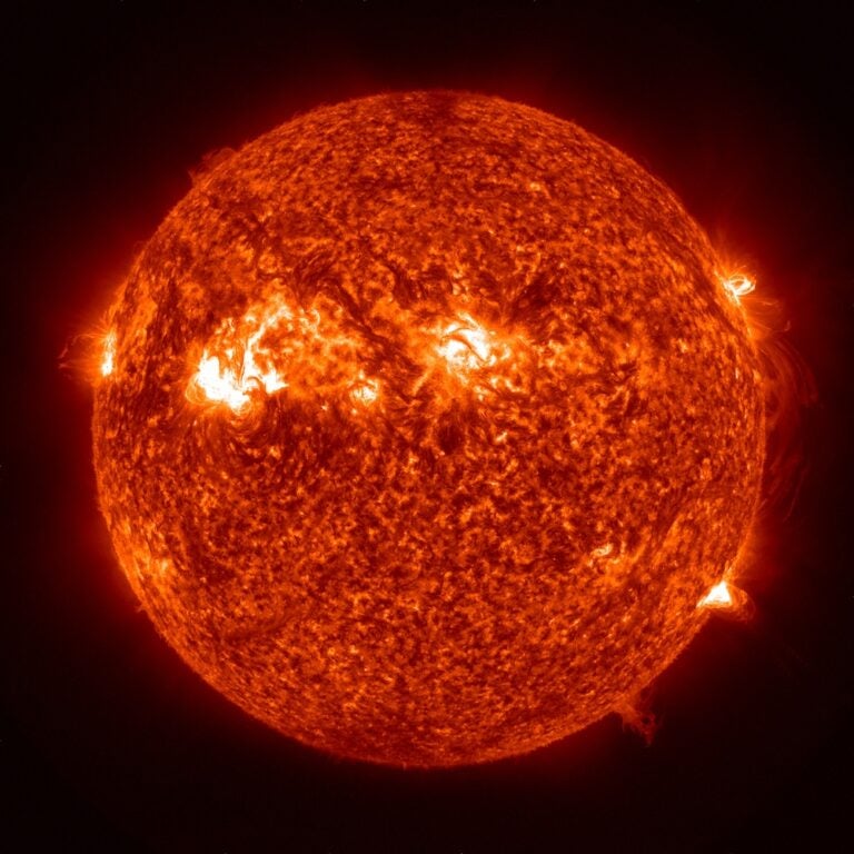
The material flung outward by solar flares can even impact satellites around Earth and electrical systems on the ground, depending on their intensity. Better understanding how these events occur is important not only for understanding the nature of our star and others, but also for predicting and potentially even mitigating damage from solar flares and the coronal mass ejections that sometimes accompany them.
The team’s work was published November 26 in Nature Astronomy.


