NASA’s timeless “worm” logo is back.
The NASA logo was introduced in the mid-70s, retired in 1992, and then brought back — only for a while — in 2020. Now, it’s back for good. NASA officially returned its 1970s symbol Nov. 6 live from Washington, D.C (which you can watch below).
David Rager, NASA’s creative director, said the logo will be incorporated alongside NASA’s primary “meatball” logo on aircraft, space launch systems, around NASA buildings, and merchandise.
“Aesthetically, some might say they come from different planets, but we found with just the right balance they complement each other fantastically,” Rager said.
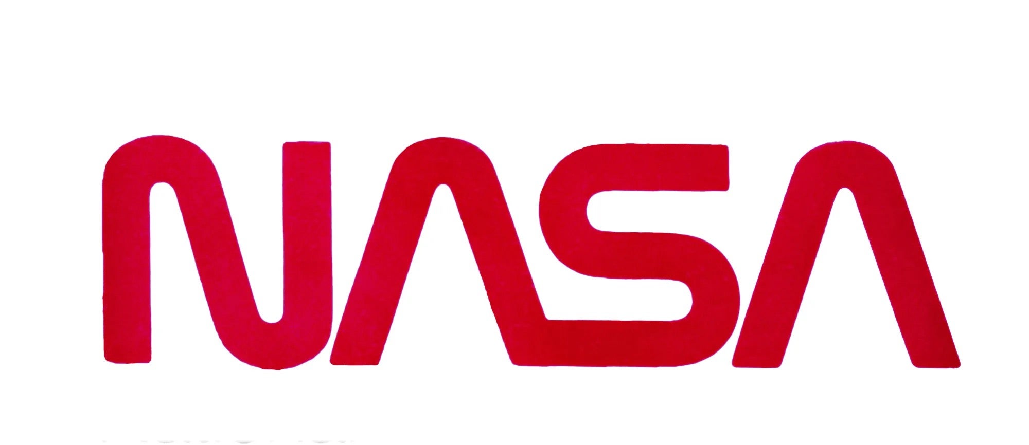
The NASA ‘worm’ logo
In 1971, President Richard Nixon sought to update federal government graphic design with the Federal Design Improvement Program, which you can read more about here on the National Endowment for the Arts site. The program helped create logos for more than 40 federal agencies, including NASA.
The “worm” logo was designed as a sleeker, more modern alternative to NASA’s current primary logo or insignia known lovingly as the “meatball.” In the 1970s, the ‘meatball’ was more challenging to reproduce and print, and its symbolism was not quite right for a modern space era, according to NASA.
Richard Danne and Bruce Blackburn designed the typeface with a stylized version of the word NASA in a shade of red that “reflects the lively and future-orientated character of NASA,” according to the space agency’s Graphics Standards Manual. The A’s in NASA were a nod to the shape of a rocket’s nose cone, Michael Bierut said during the Nov. 6 press conference. The “worm” served as NASA’s logo until 1992, when the “meatball” returned.
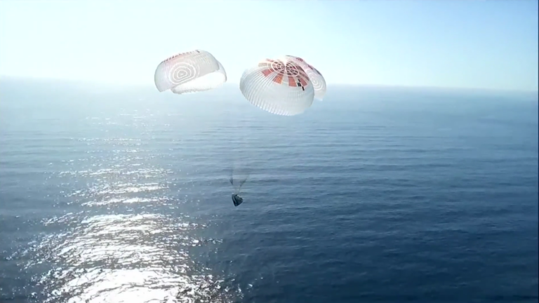
The “worm” made its return on Space X’s Falcon 9 launch vehicle that flew during the Crew Demo-2 test flight in 2020. “A continuously flowing line conveyed a sense of modernity, progress, and propulsion,” Rager said in the NASA TV press briefing.
The ‘meatball’ NASA logo

The iconic circular “meatball” symbol was created in 1958 by James Modarelli, but wasn’t NASA’s official logo until a year later. The blue, red, and white symbol was designed using elements that represented NASA’s mission. The blue sphere represents a planet. The stars found within the blue planet shape represent space, and the red wing-shaped object in the middle represents aeronautics. The circular orbiting line around the word “NASA” and the red wings represent space exploration.
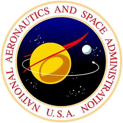
The “meatball” was the space agency’s most-used symbol for almost two decades until the more modernized logo was introduced in the mid 1970s. Dan Goldin, NASA’s administrator in 1992, brought back the primary logo design to “invoke” the nostalgia of the Apollo missions. Aside from NASA’s primary logo, the space agency uses a seal (above) that is a more dressed-up version of the meatball that is used for more formal events.


